
Forecast International
Improving an enterprise market forecasting product
Redesigning Forecast International's data forecasting software-as-a-service app and rethinking how they used their website to drive new lead generation.
Project ACTIVITY
2023
Project Roles
UX/UI Design, Branding, User Research, Project Management, Information Architecture
Background
What if a legacy platform constrained by outdated code could still deliver a 30% increase in lead registrations and sustained engagement growth? This was the challenge I embraced as the lead UX designer for Forecast International, a recently acquired company navigating the complexities of team integration, accessibility improvements, and brand transformation. By balancing design intent with technical limitations, our team turned constraints into opportunities, delivering measurable results that set the stage for future growth.
Forecast International had recently been acquired and was in the process of integrating and merging teams and technologies. As part of the integration process, our product team was tasked with helping onboard new team members and potentially implementing accessibility improvements across their products.
Our team included a product manager, two product developers and myself, lead product designer.
RESEARCH METHOD
To understand user needs post-acquisition, we conducted user satisfaction surveys that revealed two critical areas for improvement: while paid users appreciated the product, they felt it fell short of its marketing promises, and accessibility inconsistencies needed to be addressed. These insights guided our focus on refreshing the marketing site to drive sales leads and improving accessibility to better serve the user base.
Key Motivators
Address declining user engagement: Enhance core product features to retain and grow the user base.
Improve accessibility: Update designs to ensure inclusivity and compliance.
Reposition the marketing website: Streamline the user journey to increase lead registrations and conversions.


Problem Statement


Execution
LIMITS
As development progressed, a notable element in the execution of this project was how much insight we were able to obtain from our communication with the two product developers. Their expert knowledge and product wisdom, provided very clear guidance on what we could ultimately implement and where we could focus our improvements with the most effectiveness.
Our final designs were ultimately constrained and impacted the most from the systems older code platform. As a result, execution effectively became an update to the brand as well since the system constraints limited what we could do.
Review
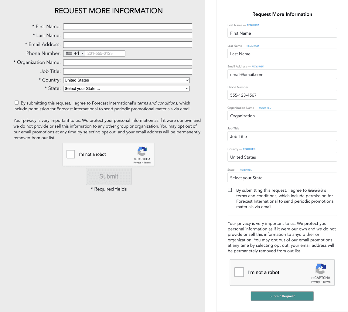
We analyzed and streamlined user flows to make processes more efficient. For example, we cut a lead capture process from five steps down to just two. This was mostly accomplished through reworking their information architecture and design.
Throughout every phase of the project, we focused on improving the customer funnel and updating user flows.
We also redesigned components to match the new brand experience and prioritized accessibility.

Challenges
Stakeholder Engagement:
Long delays in feedback from client teams required us to reprioritize and focus on other projects, leading to timeline extensions and context-switching lag.
Technical Limitations:
The legacy codebase restricted design possibilities, necessitating creative compromises between design intent and feasibility.
Resource Constraints:
Limited developer resources and shifting stakeholder priorities caused occasional project fatigue and stalled progress.
To address these challenges, we prioritized agile communication, maintained flexibility in project scope, and collaborated closely with developers to find practical solutions. All this to say, the key to maintaining all of this was our weekly chats.
TAKEAWAYS
After rerunning our user engagement surveys, engagement has shown six months of continued improvement from the accessibility and branding improvements.
The homepage and website redesign show initial improvement in lead registrations increasing 30% month to month.
The project was also validated when the largest client subscriber granted access to the platform for their internal employee use.
I would estimate nine months of project engagement but really only about sixty days of actual head-down work. It was often necessary to keep open communication but without project movement on, for example, design feedback. Much of that actual work was spent in communication and breaking out the capabilities of these older legacy systems design constraints. For me in terms of design, jumping in and out of the project took its toll on the level of elevation I was looking for. But, that is ok, the design we ended up with works really well and leaves room for scaling and retooling of the components that got built out.
The products can still use a lot of attention. The site I think can now be adjusted at an improved schedule.
Impact
From a business perspective, the project was a success. We enhanced engagement, refreshed the brand for future product improvements, and improved accessibility
From a design side, I think there was room to push the design further. However this was a suitable approach given the established and fixed user base and the business’s low appetite for risk. If, in the future, they want to implement a new feature they'll have those components setup and ready to get building.
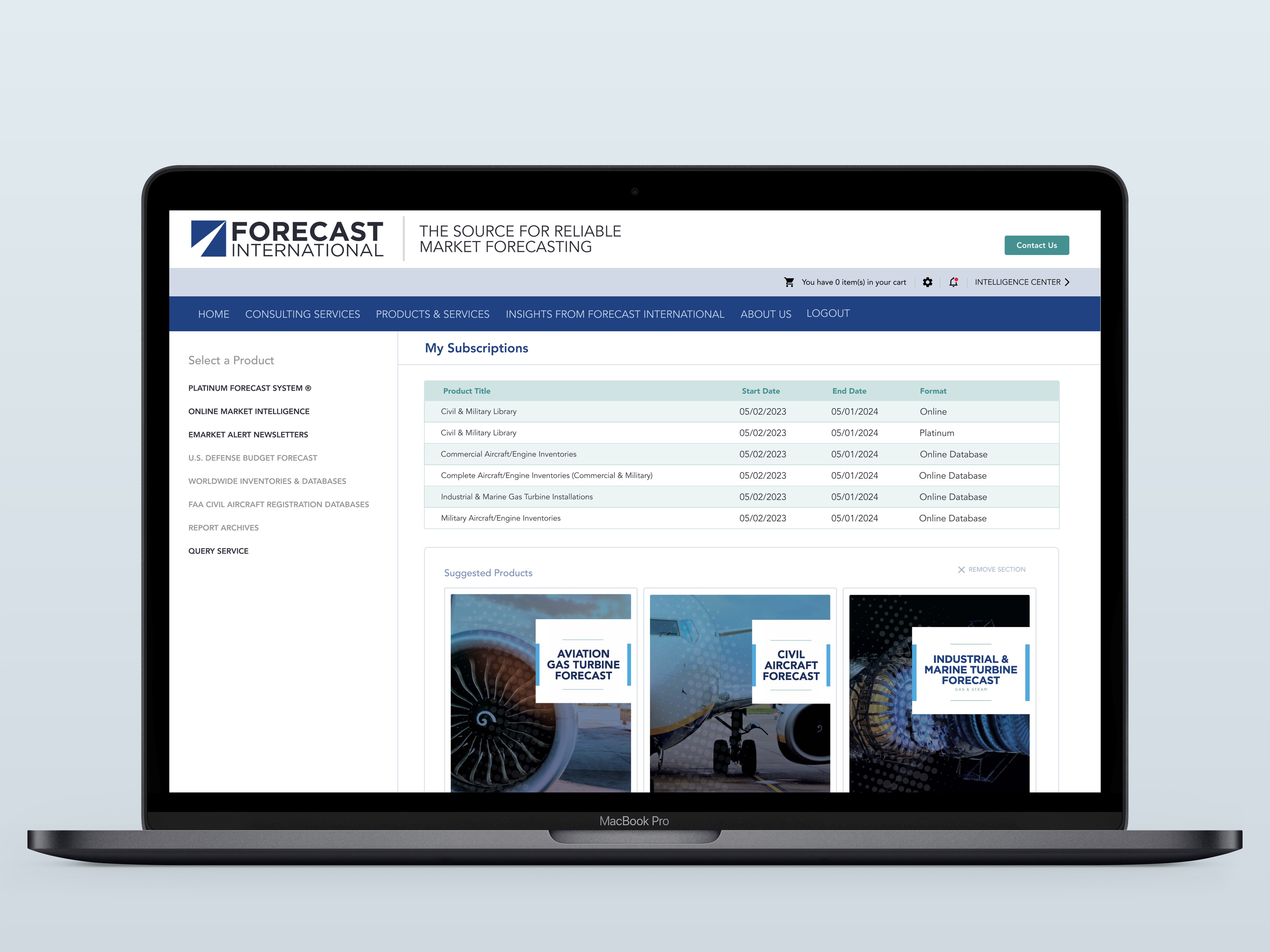
Final design data layout

Final design
